Mai Milk is a 2020 dairy-sector identity project. The opening artwork brings several product containers together, using white, red and purple to make the brand recognisable across different pack shapes. A cow motif and the Mai name connect the product presentation to the dairy category without requiring a long explanation of what is being offered.
01Consistency across different containers
The main presentation shows the identity on more than one container format. The name, illustration and colour relationships remain connected even when the shape and scale of the pack change. This is an important way to review a dairy identity: the design needs to be recognisable across the range rather than only on one preferred mockup.
02A direct category language
Milk imagery, the cow motif and a predominantly white product area provide immediate category cues. Red and purple supply contrast around those familiar elements. The work can therefore be read first as a dairy product presentation and then as a particular brand, with both levels visible in the same composition.
03The published collection
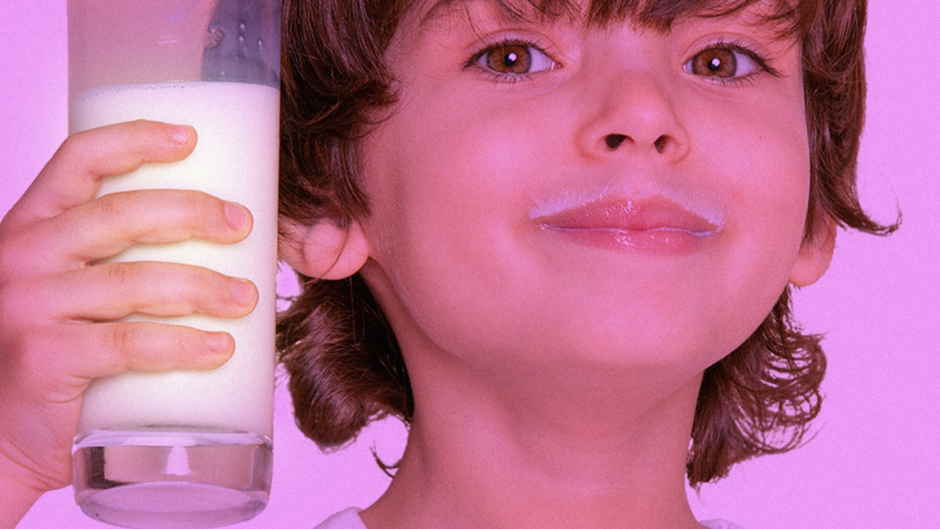
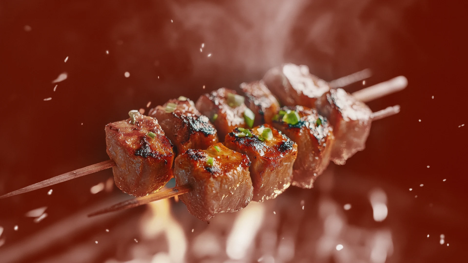
All five pieces from the original Mai Milk case-study page are included below. They show the identity and supporting creative as the agency published it. The case does not attach food-quality, nutritional or sales claims to the visuals. Those are separate matters that require product-specific information and evidence.