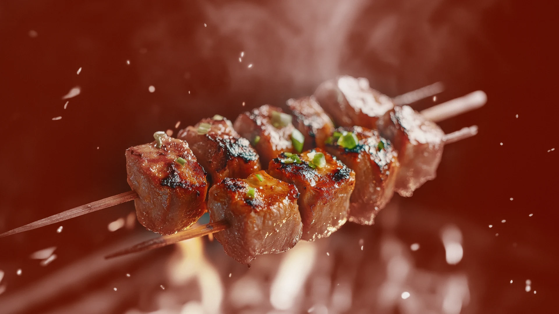
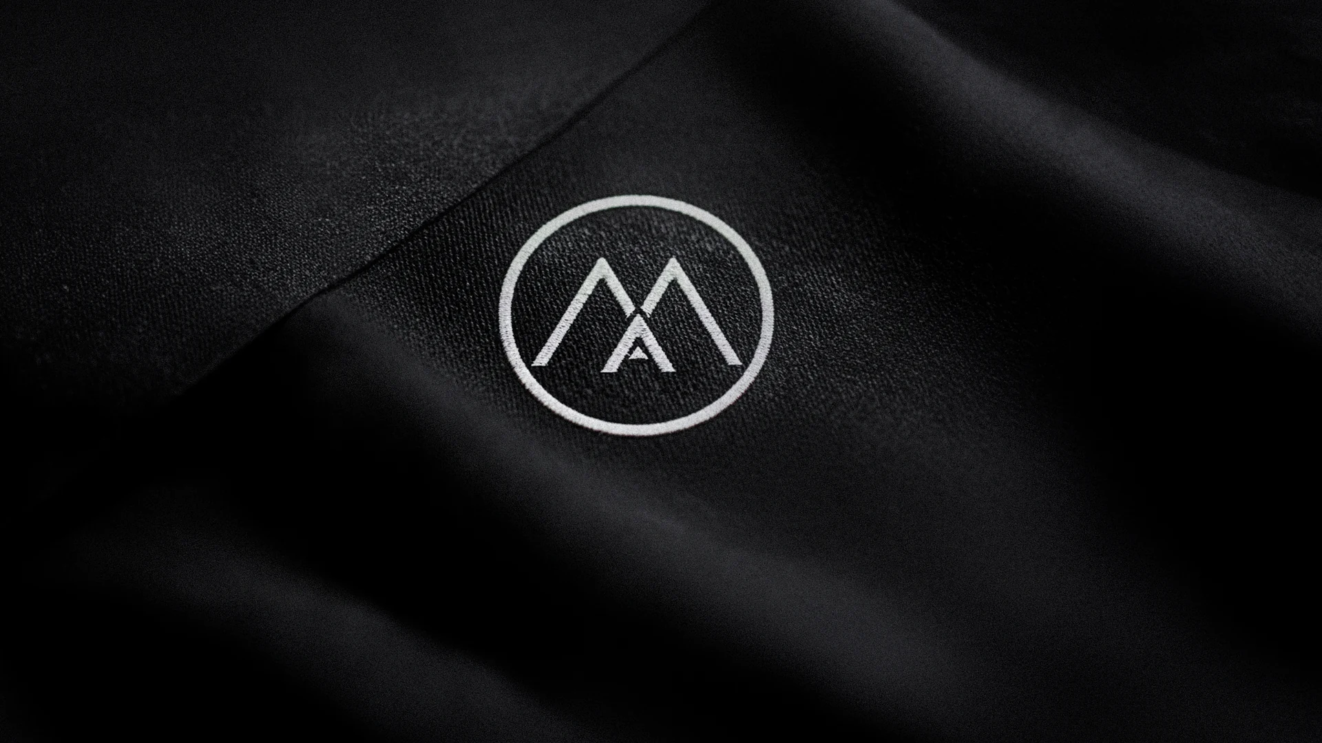
Simply Barbeque is a 2018 branding project in the original food and FMCG portfolio. The opening artwork uses glowing charcoal as its setting, placing the name directly in the world of the product. A bold wordmark and a compact circular emblem give the identity a readable shape against the highly textured background.
01Starting with the product experience
The charcoal image is not simply a neutral background. It places the brand in a recognisable cooking context before any supporting explanation is needed. The contrast between the white wordmark, the warm emblem and the dark coals gives the identity a clear point of focus within that setting.
02An identity built to be seen
Food branding has to work with photography and textures that can already be visually busy. Here, the name is organised as a compact, bold block, while the emblem supplies a separate identifying element. The complete collection shows the relationship between those elements across the supporting presentations rather than limiting the project to the opening logo image.
03The original project material
All seven creatives from the published Simply Barbeque page are included below. They provide the visual evidence for the identity and its applications. The source does not publish a detailed commercial brief, customer research findings or performance data, so this case does not attach those claims to the work.